
 This was a poster I created for the Sidekicks CD release show for their new album "Weight of Air." They were screen printed on 11x17 parchtone paper. The show was a ton of fun, and the new Sidekicks album is amazing!
Sunday, September 13, 2009
The Sidekicks
This was a poster I created for the Sidekicks CD release show for their new album "Weight of Air." They were screen printed on 11x17 parchtone paper. The show was a ton of fun, and the new Sidekicks album is amazing!
Sunday, August 9, 2009

Sunday, May 24, 2009
Toothbrush Museum


For this second and final project of GD2 we had to pick a random object and create a fictitious museum for it. The object I chose was a toothbrush. For the first part of the project we had to create a 3 page ad series that promoted the museum. My concept was that in each of my ads they were showing one of the most prehistoric type of toothbrushes. For example, the first is a birds feather, the second consists of boar bristles, and the third consists of twigs.

The second part to the project is creating a guerilla concept. My concept involves using toothpaste as a way to graffiti on already existing linework. For example, it serves as wayfinding for the museum by making a toothbrush figure on the white lane dividing street lines. And then there would be an arrow on the next line to tell you which way the museum is.

The third part of the project consisted of making a 3D piece. I did an environmental mock-up as well as a 3D promotional piece. For the environmental portion I was just playing up the idea of using the vertical shaft of the light pole as the plastic body of the toothbrush, so on the right there would be bristles on the banner.


The other 3D piece is a promotional item that would be passed out at opening day of the museum. I wish I took pictures of the actual product, because it would make more sense. But The item is a toothbrush bracelet that you can make from your old toothbrushes. The bracelet would come with a double sided guide that would tell you all the possibilities to recycle your old toothbrushes as well as directions on how to make the bracelet.
Monday, April 13, 2009
GD2: Exercise 1


Dangerous Shoes
 This is my most recent Illustration 2 project in which we had to create an editorial illustration for "Dangerous Shoes" that would be featured in Skirt magazine.
Illustration 1: Problem 4
 This is definitely an older project, but I really like it. This was our last project in Illustration 1, which I took last fall. The objective was to select a statistic from different statistic websites and illustrate it. The one I chose was "A bad case of laryngitis forced Abe Lincoln to lip-sync the Gettysburg address. Supposedly the speech was actually delivered by an aide hidden beneath the stage."
Junior Review
 For exercise 4 of GD2 we were to create posters for Junior Review. All of our posters are put up for display in the Art Building, and the faculty choose the winning poster in which we will sign up. Junior Review is a two day event in which we, the juniors, sign up for a 15 minute time slot in order to meet with a panel of faculty who critique and comment on our work. Through this review we will find out whether we will enter the BA program, BFA program, or fail at life altogether. My poster is in the style of those old boxing posters.
 I signed up for 11:30 on thursday.
Is it hot?
 For exercise 3 in GD2 we were to design a visual response to the phrase "Is it hot?" There were no guidelines whatsoever, and it was completely up to our interpretation. I decided to do a gig poster for a concert at the House of Blues featuring The Flaming Lips, Arcade Fire, and The Fiery Furnaces. Now if you ask me, that would be one "HOT" show. It is also kind of funny, because when I was designing this poster I read on pitchfork that Wayne Coyne from Flaming Lips was talking smack about Win from Arcade Fire. So maybe they wouldn't want to play my imaginary show...
Inequality Matters
 For our 2nd exercise in GD2 we had to create a poster for the inequality matters project from AIGA. All of the guidelines were at the AIGA site. It turned out alriiiight, but not my favorite piece.
Papermoons

I haven't posted anything in a while, so that means I'm pretty much going to dump some of my recent projects up here. This is a flyer I made for an Annabel, Papermoons, and Tin Armor show at the Musica in Akron. The show was on April 4th, and turned out to be spectacular. All of the bands were awesome, and there was a great turn out.
Wednesday, January 21, 2009
Illustration 1: Problem 2
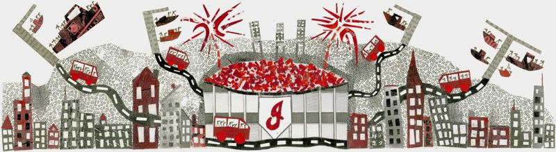
So I am totally posting these out of order, but oh well. This is the second problem that I had to do for Illustration 1. The problem involved making an illustration to promote traveling in Northeast Ohio. We had to chose some form of transportation and a place or event of some sort. For my final, I chose to illustrate taking a boat to Cleveland, parking it at a dock and then taking a bus to Progressive Field to see an Indians game. It is a mixed media piece made up of collage and ink.
Also! The format is really wide, so it isn't going to fit in this window. But if you click on the image you can see the whole thing!
Monday, January 19, 2009
IT DOESN'T EVEN UP!
Here are the latest shirts I printed for Annabel. I recently got the movie Helvetica for Christmas and was inspired to use it for a shirt. I am guilty of using Helvetica on more things than I probably should, but I think it was just necessary. "It doesn't even up" is a lyric from one of our songs called Parade Rest. It's on our myspace; check it out! www.myspace.com/annabelrock. If you are interested in purchasing one of these shirts, they are only $5 and are printed on plain white Fruit of the Loom or Hanes shirts i bought from Gabriel Brothers.


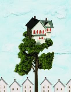
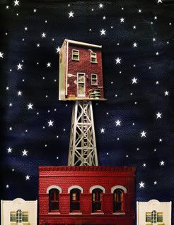
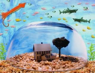
Phototech Final
For our final in Phototech we were allowed to choose whatever we wanted to do, but it had to have a distinct concept. The concept I chose was kinda weird and quirky, but it turned out to work pretty well. My concept was that in the future there would be no land left to build houses so we would have to resort to building on top of structures, or in my case underwater. The first picture is placed in a suburb where the house is built in a tree. The second is a city scene where the apartment building is built on a watertower-like structure. And the third picture is inside a dome underwater. I didn't necessarily illustrate how people would get inside, up, or down into their houses, but I think they still work. To make these I took pictures of my own props and made digital composites in photoshop, and the backgrounds are just watercolor spots.
Sunday, January 18, 2009
Phototech Diptychs
I took a photo class called Photo Technology last semester, which was a more or less an intermediate level photography class with more advanced photoshop techniques. Overall, through the class I learned how to use Camera Raw and I learned new skills in photo editing. The objective of the first project was to shoot people in their environments, and it was to center around a general theme. The theme i chose was "Music Producing." The assignment also required us to make diptychs, which included the person in their environment as well as a detail.


Annabel CD Release Show
I haven't finished posting up all of the images from last semester (Illustrations & Photography). But i've still been productive with other little projects. The last thing I've been working on was for my band, Annabel, which was a flier for our CD Release Show. The show will be held at The Rathskellar in Kent, OH with some of our good friends Delay from Columbus, and See Urchin, our other Kent friends.

GD1 Problem 3: Short Term Identity


The pictures I took are pretty DIY, and i should have taken them on a black background. But i'll probably re-shoot them for my portfolio anyway.
GD1 Problem 2: Time 100 Book
For our 2nd problem in GD1, we were to design a book which documents the historical significance of someone from the list, Time 100. I did not end up choosing from the list because it wasn't required by our professor. I ended up designing my book for Brian Wilson from the Beach Boys. Overall i'm happy with how this project turned out. I had a lot of printing problems, for some reason it was hard to get all of the colors right, but it all worked out in the end. I decided to make it more hands on than a regular book by adding pull outs and paper engineering methods. Click on the pictures to see them larger.


Subscribe to:
Comments (Atom)
